Brand Colour Palette
Set your primary, accent, and background colours for consistent branding.
Open colour settings
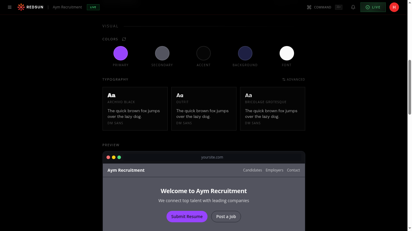
In the Branding tab, scroll down to the VISUAL section. You'll see five colour circles: PRIMARY, SECONDARY, ACCENT, BACKGROUND, and FONT.
Set your primary colour
Click the PRIMARY circle to open the colour picker. This is your main brand colour — used for buttons, links, and key visual elements. Enter a hex code or use the picker.
Choose a colour with strong contrast against dark backgrounds — it needs to be readable as button text and link colour.
Configure accent colours
Set SECONDARY and ACCENT colours that complement your primary. These are used for secondary buttons, highlights, and decorative elements throughout your site.
Background & font colours
Set your preferred BACKGROUND colour (typically dark for a modern look) and FONT colour ensuring sufficient contrast for accessibility.
Preview across pages
After setting colours, check the PREVIEW section at the bottom of the page to see how the palette looks in a mock site layout. Colours cascade across all sections and pages automatically.
Guide complete
You've covered all 5 steps. Check out the related guides below.
Still need help?
Our support team is here to assist you.